
Новий логотип до нового року
Якщо ви читаєте наш Блог, то, сподіваємось, помітили деякі зміни в нашому логотипі та дизайні сайту. Минулого тижня ми були раді представити наш новий логотип та брендинг у невеликому колі наших прихильників та контактів.
Ми, звичайно, любимо наш старий логотип, який служив нам багато років. Але він почав виглядати трохи застарілим, і настав час оновити весь брендинг, щоб він підходив для всіх цілей.

Старий логотип
Сучасний логотип повинен працювати на папері, товарах і в цифровому форматі на пристроях будь-якого розміру. Він повинен мати гарний вигляд як мініатюра в соціальних мережах, так і на великому плакаті на заході. І при цьому він повинен представляти культуру організації.
Головне, що ми хотіли - це логотип, який був би набагато чистішим і простішим. Тоді як первинна версія нашого старого логотипу мала шість окремих кольорів (шість!). Наш новий логотип однотонний, в одному з наших нових фірмових кольорів.
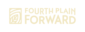
Зображення листя нагадує про природу і нове зростання, а шрифт показує центральну "стежку" між словами Fourth Plain і Forward, що представляє як коридор Четвертої рівнини, так і розташовану поруч річку Колумбія.
Для організації завжди важливе рішення змінити звичний брендинг, але ми в захваті від результатів, і сподіваємося, що ви погодитеся, що вони виглядають фантастично.